Graphs and Excel charts are a great way to visualize complex datasets, and Bell curves are no exception. They let you analyze a normal distribution easily and can be easily created in Excel. Let’s find out how.
Keep in mind that the purpose of a bell curve goes beyond simply prettifying the data. There are many forms of data analysis that can be performed on such a chart, revealing many trends and characteristics of the dataset. For this guide, though, we will be only focusing on creating a bell curve, not analyzing it.
Introduction to a Normal Distribution
Bell curves are only useful to visualize datasets that are distributed normally. So before we dive into bell curves, let us take a look into what a normal distribution even means.
Basically, any dataset where the values are largely clustered around the mean can be called a normal distribution (or a Gaussian distribution as it is sometimes called). Most naturally collected datasets tend to be like that, from employee performance numbers to weekly sales figures.
What Is a Bell Curve And Why Is It Useful?
Since the data points of a normal distribution are clustered around the mean, it is more useful to measure the variance of each data point from the central mean rather than its absolute value. And plotting these variances in the form of a graph yields a Bell Curve.
This allows you to spot the outliers at a glance, as well as see the relative performance of the data points with respect to the average. For things like employee appraisals and student scores, this gives you the ability to tell the underperformers apart.
How to Create a Bell Curve
Unlike many simple charts in Excel, you cannot create a bell curve by simply running a wizard on your dataset. The data needs a bit of pre-processing first. Here is what you need to do:
- Begin by sorting the data in ascending order. You can do this easily by selecting the whole column and then heading to Data > Sort Ascending.
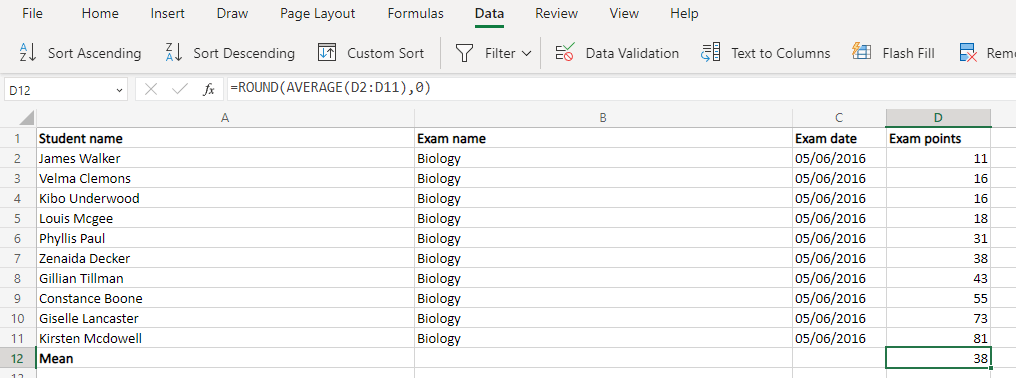
- Next, calculate the average value (or Mean) using the Average function. As the result is often in decimals, it is a good idea to pair it with the Round function as well.
For our sample dataset, the function looks something like this:
=ROUND(AVERAGE(D2:D11),0)
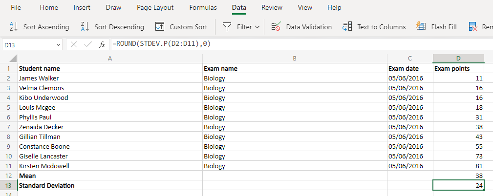
- Now we have two functions for calculating the Standard Deviation. STDEV.S is used when you only have a sample of the population (usually in statistical research) while STDEV.P is used when you have the complete dataset.
For most real-life applications (employee appraisal, student marks, etc.) the STDEV.P is ideal. Once again, you can use the Round function to get a whole number.
=ROUND(STDEV.P(D2:D11),0)
- All of this was just prep work for the real values we need – the Normal distribution. Of course, Excel already has a dedicated function for that as well.
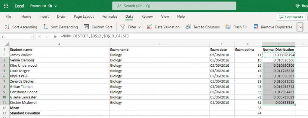
The NORM.DIST function takes in four arguments – the data point, the mean, the standard deviation, and a boolean flag to enable cumulative distribution. We can safely ignore the last one (putting in FALSE) and we already calculated the mean and the deviation. This means we just need to feed in the cell values and we will get the result.
=NORM.DIST(D2,$D$12,$D$13,FALSE)
Do it for one cell and then just copy the formula over to the whole column – Excel will automatically change the references to match the new locations. But make sure to lock the mean and standard deviation cell references first by using a $ symbol.
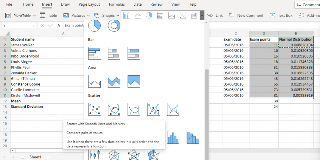
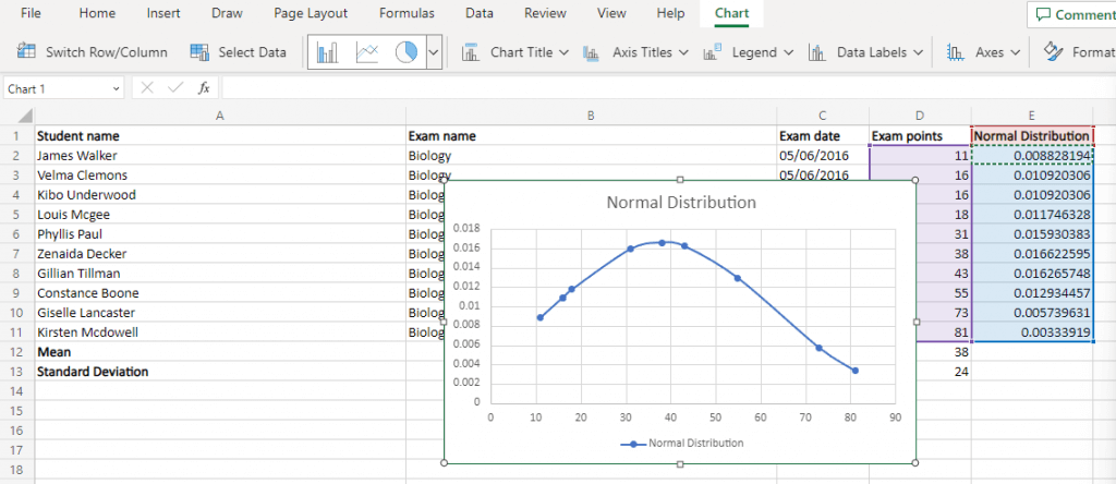
- Select this normal distribution along with the original values. The distribution will form the y-axis while the original data points form the x-axis.
- Head to the Insert menu and navigate to the scatter diagrams. Select the Scatter with Smooth Lines option.
What Is the Best Way of Creating a Bell Curve Chart in MS Excel?
Bell curve charts might seem complicated, but are actually pretty simple to create. All you need is the normal distribution points of your dataset.
First, determine the mean and the standard deviation using built-in Excel formulas. Then use these values to calculate the normal distribution of the entire dataset.
The bell curve chart is just a Scatter with Smooth Lines plot using the original data points for the x-axis and the normal distribution values for the y-axis. If your dataset was normally distributed, you will get a smooth bell curve in Excel.
Now that you know how to create a bell curve chart in Excel, look at how to make a Gantt chart, heat map, or waterfall chart for your next project.
Related Posts
Levin Roy is a software engineer who loves writing about technology. Whether it is Windows tips-and-tricks or in-depth guides about application development, Levin uses his practical experience and technical skills to create articles that can help solve tricky problems. Read Levin’s Full Bio


