If you have data that you want to display graphically, but a chart isn’t quite right, try a heat map. You can create a heat map in Excel to present your data in an easy-to-read way.
What Is a Heat Map?
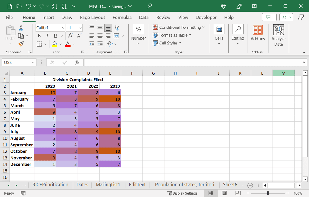
A heat map is a visual representation of data using colors. This can be a diagram or map where the colors correspond to the number values in a dataset.
The most common example of a heat map is when you watch the weather report on your favorite news channel. You may see temperatures across the country or region showing red for hot, orange for warm, and yellow for cooler temperatures, for instance.
This type of visual is useful when you have a wide range of values spanning several categories. As examples, you may have sales for store departments across years or averages of student grades across weeks or months.
Here, we’ll show you a few different ways to make a heat map to attractively display your data.
Create a Heat Map With Conditional Formatting
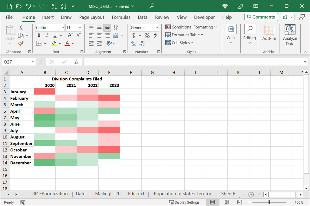
The simplest way to create a heat map in Excel is using conditional formatting. With it, you’ll see different colors or shades of colors based on the values in your cells.
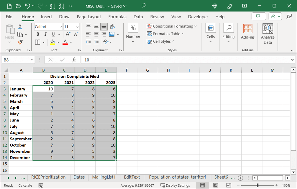
- To get started, select the cell range you want in the heat map without any column or row headers.
- Go to the Home tab, open the Conditional Formatting drop-down menu, and move to Color Scales. As you move your cursor over the 12 options, you can see a preview of each applied to your data.
- Choose the one you want to use, and you’ll see your data update.
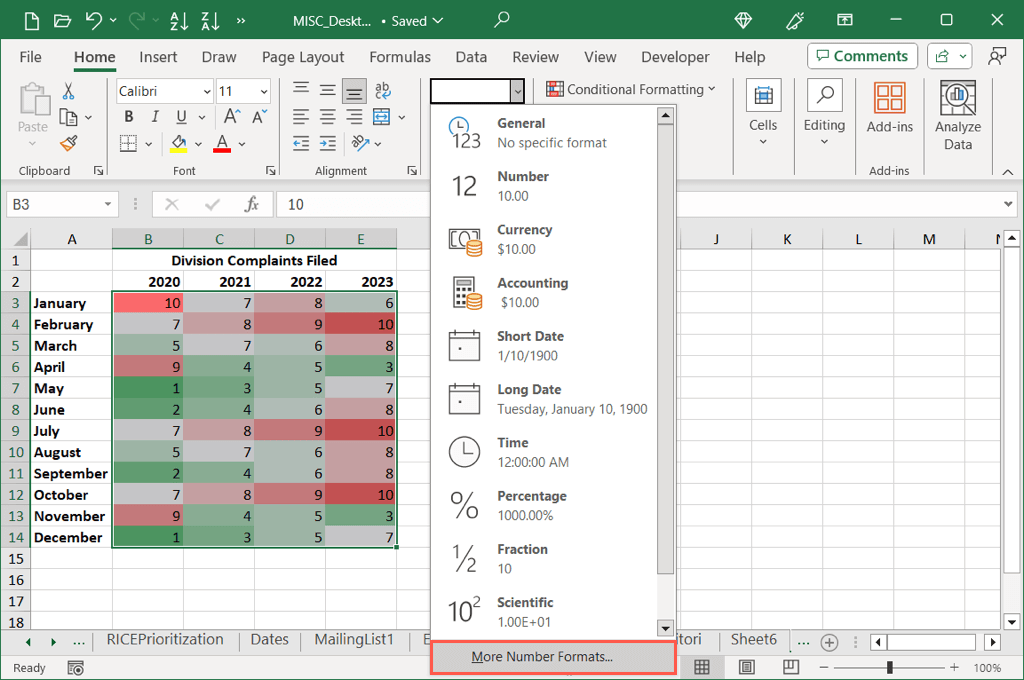
As you can see in our example, we have the highest values in red and lowest values in green making both easy to spot.
Use Custom Colors
While the preset Color Scales give you basic red, blue, yellow, and green, you may want to use either a specific color set or only two colors. For this, you can create a new formatting rule to your specifications.
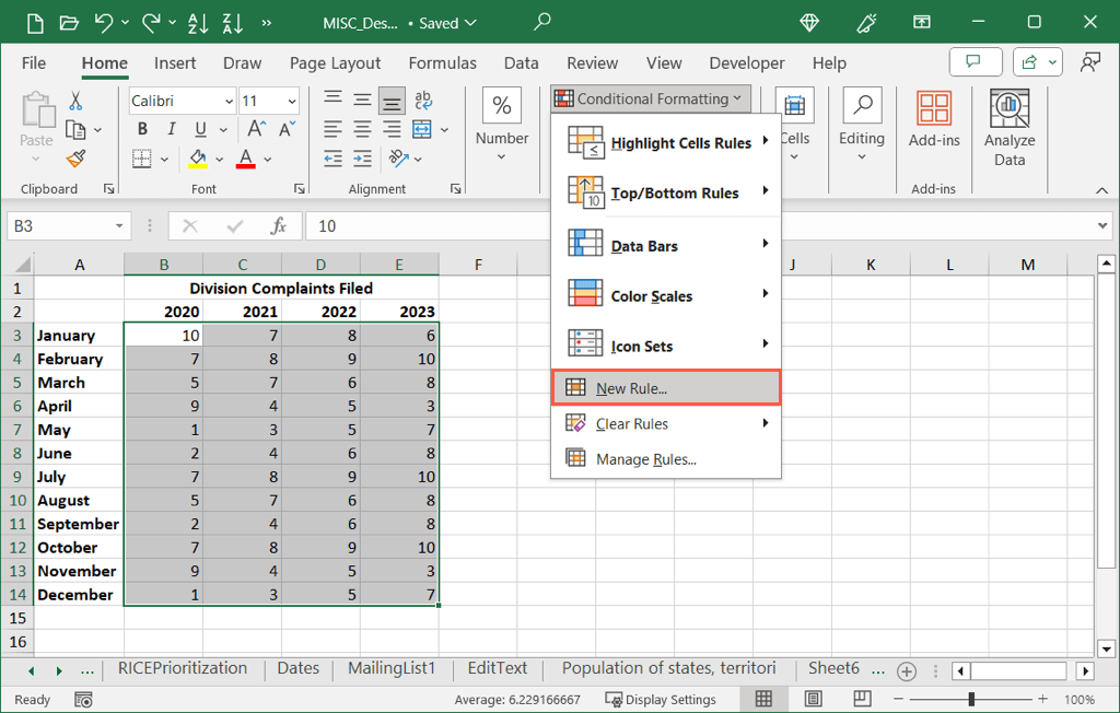
- Select the data you want to include, go to the Home tab, open the Conditional Formatting drop-down menu, and pick New Rule.
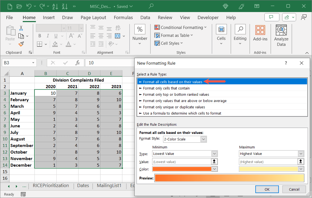
- When the dialog box opens, choose the first option at the top for Format all cells based on their values.
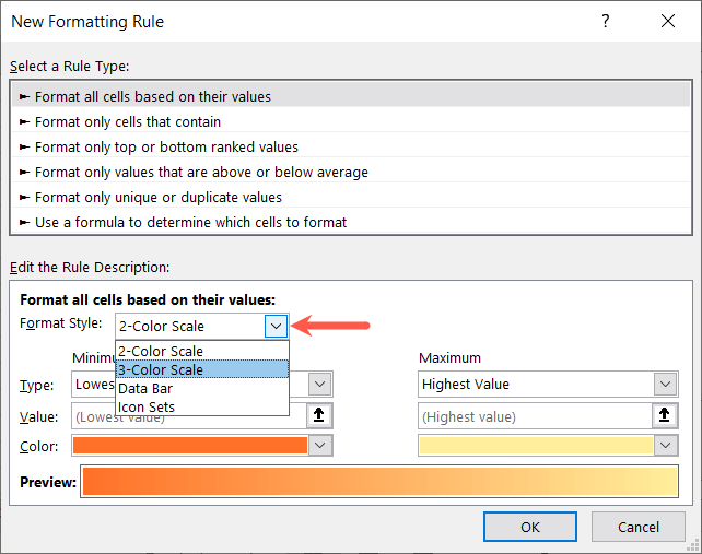
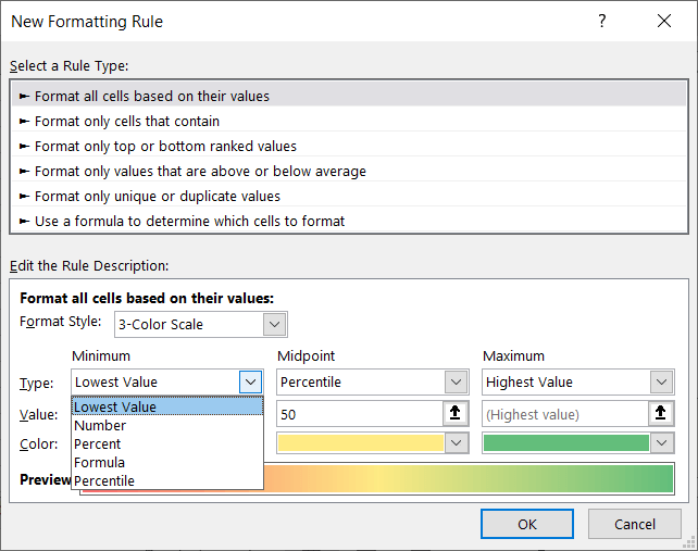
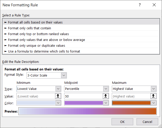
- In the bottom section, use the Format Style drop-down box to pick either the 2-Color Scale or 3-Color Scale.
- Then, complete the details beneath:
- Type: Choose the value types for the Minimum and Maximum as well as Midpoint if you use the 3-Color Scale.
- Value: Choose or enter the corresponding value for the Type you pick above it. For instance, if you select Percentile in the Type section, enter the percent in the Value section.
- Color: Choose the color for each Type or pick More Colors to select a custom shade.
- As you enter the details, you’ll see the Preview update so you know how your cells will appear.
- When you finish, select OK to apply the conditional formatting heat map to your dataset.
Remove the Number Values
Because heat maps are visualizations of your data, you may want to remove the numbers in the cells and use only the colors. You might do this if the values are distracting or less meaningful than the colors.
You can remove the number values regardless of which conditional formatting rule you set up above.
- Select the cells containing the numbers. Either right-click and pick Format Cells or open the Number drop-down menu on the Home tab and pick More Number Formats.
- In the Format Cells box, choose Custom on the left. Then, below Type on the right, enter ;;; (three semicolons) and select OK.
When you return to your data, you should see the numbers gone but the corresponding colors for the heat map remain.
Create a Geographical Heat Map
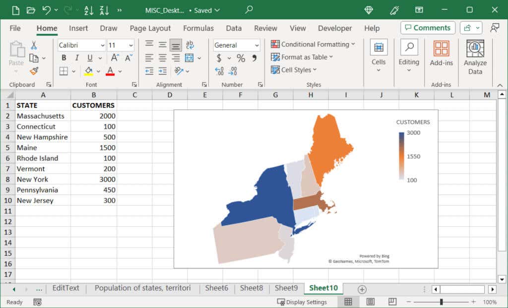
If your data relates to locations like states, regions, or countries, you can take your heat map up a level and use a geographical map chart. This still displays your values as color-coded indicators but plots them on a map with the matching locations.
- Select the data for the map and be sure to include the location names. For example, you can see below that we select the state names and the corresponding values.
- Go to the Insert tab, open the Maps menu in the Charts section, and pick Filled Map.
- When the map chart displays, you should see your values represented with colors and a legend, both of which you can edit and customize.
- Depending on the data you display and where your regions are located, you can adjust the map area, color scale, legend, and more. For general options, select the chart and use the Chart Design tab that displays. Here, you can add, remove, and edit the chart elements, adjust the layout, change the color scheme, and pick a different style.
- For data series options, double-click the series on the chart to open the Format Data Series sidebar. Confirm that the Series Options tab is selected and then expand the Series Options and Series Color sections to make your changes as described below.
- Series Options: Use the Map Area drop-down menu to show only the regions containing data. This is helpful if you’re displaying only a few states in the U.S., for example. You can also use the Map Labels menu to add those labels.
- Series Color: Use the drop-down box to pick between two and three colors for the data. You can then pick the data types for the minimum and maximum and the colors you want to use for each.
- You’ll see your map update with each change, making it easy to undo an edit if needed. When you finish, simply close the sidebar with the X on the top right.
You then have your geographical heat map to display your data as a nice visual.
Create a 3D Geographical Heat Map
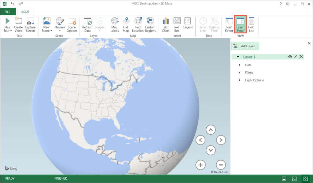
Another way to add a geographical heat map but with advanced options is using Microsoft Excel’s 3D Maps feature. With this, you have a 3D world map that you can spin and zoom. This option is useful if you want several layers or filtered data.
- Select the data for your map including the location names and optionally the column and row headers. Go to the Insert tab, choose 3D Maps in the Tours section, and pick Open 3D Maps.
Note: If you’ve used this feature previously, you’ll need to pick Start New Tour to open a new map.
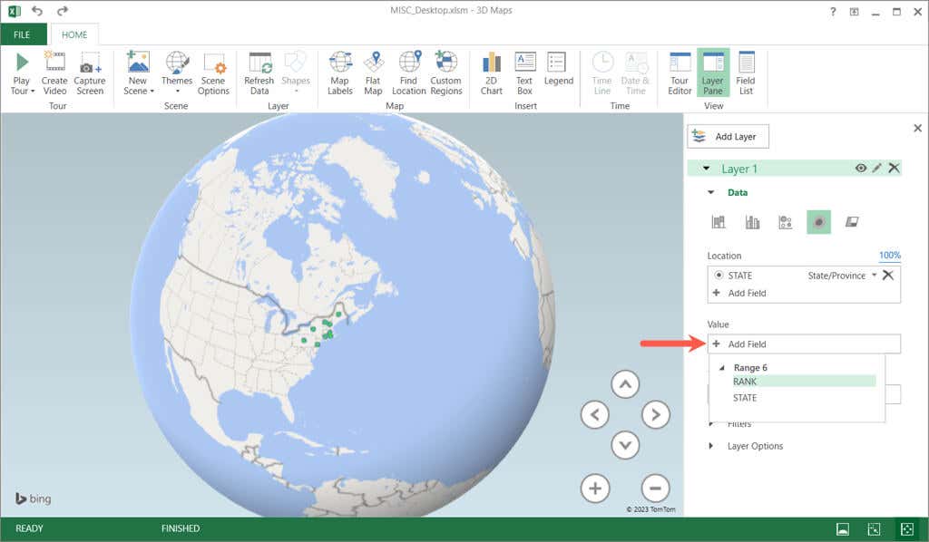
- The Layer Pane should automatically open on the right. If not, select this button on the Home tab in the ribbon.
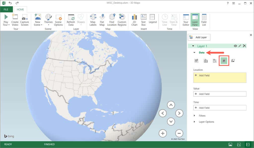
- Expand the Data section in the pane and pick Heat Map.
- Select Add Field in the Location box and choose the location data. For our example, this is State.
- Select Add Field in the Value box and choose the value data. For our example, this is Rank.
- You should see your locations and values plotted on the 3D map as a heat map. Use the plus and minus buttons to zoom in and out or the directional arrows to move the map. You can also select and drag to spin the map.
- To change the colors, expand Layer Options. Then, use the Color Scale, Radius, Opacity, and Colors tools to make your adjustments.
- You can also use the ribbon tools on the Home tab to pick a theme, add a text box, create a video, and more.
- To place the map in your Excel sheet, select Capture Screen in the ribbon on the Home tab. This places a screenshot of the map on your clipboard.
- You can then paste the image in your worksheet using Paste on the Home tab or the keyboard shortcut Ctrl + V.
Will You Turn Up the Heat?
Heat maps are terrific visuals for displaying data in color form instead of with numbers, percentages, decimals, or dollars and are ideal when an Excel graph just doesn’t fit.
Are you going to make a heat map in Excel? If so, let us know which method you choose.
Related Posts
Sandy Writtenhouse is a freelance technology writer and former Project, Department, and Program Manager. She turned her education, job experience, and love of technology into a full-time writing career. With all sorts of gadgets in her home and her hands, she seeks to help others make life easier through technology. Read Sandy’s Full Bio

