Delivering presentations via PowerPoint doesn’t have to be boring. No matter who your audience is, you can create slides that are engaging, effective, and to the point. PowerPoint Slideshows can incorporate video, be converted to DVD, PDF and more.
Before you create the first slide, identify the goal of your presentation. What do you want your audience to learn, understand, and do at the end?

Create an outline, do your research, and consider your audience. Map out the main points you want to deliver, include supporting details, and determine where visuals will have the most impact.
This article will outline ten tips to design a presentation to deliver an engaging PowerPoint slideshow presentation.
- Tell a story.
- Don’t use too much text.
- Represent your content visually with images.
- Use bullet points effectively.
- Font style and size.
- Add some humor.
- Include some metaphors.
- Don’t tell them, show them.
- Present date using SmartArt.
- Transitions and animations.
Tell a Story
When you are planning and preparing your outline, think about the content as a continuous story.
Structure your presentation the same way you would a speech or essay. Start with an introduction, add supporting points, and then conclude with a summary and call-to-action (CTA).
Don’t Use Too Much Text
PowerPoint is a visual aid for your PowerPoint presentation. Your slides should add to your speech, not replace it. Too much text can be confusing and distracting to your audience.
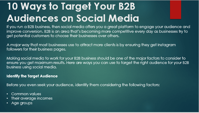
In the example above, the audience will be reading the slide and won’t hear what you are saying.
Break up the text into multiple slides and elaborate on them while you are presenting. Try something more straightforward and more concise such as the slide below:

The slide above is your title slide. The colors and font size draw your eye to the short text. It’s easy to read quickly so that your audience can turn their attention to what you are saying rather than reading a slide.
For subsequent slides, use the most salient point of what you will be discussing and make it visually appealing as in the example below.

You should use the text as a summary to emphasize your talking points.
The human brain processes images faster than text. Use images or other visuals in your presentation to help get your point across, enhance what you are saying, and elicit emotions from your audience.
To illustrate this point, we can replace the first slide above with too much text while staying with the same content about how businesses can target their B2B audience.
When you move onto the slide below in your PowerPoint presentation, it tells the audience that a businessman is happy and has hit the target.

There is no need to use words on the screen to relay this message as the image tells the story itself. The audience will see it, understand what it means instantly, and then focus their attention on what you are saying.
Use Bullet Points Effectively
Bullet points are useful in PowerPoint when trying to break up chunks of text that will cause your audience to read your presentation rather than listen to you speak.
Use bullet points to simplify content and list key information. Limit the number of bullet points to no more than five per slide. You can also add a little creativity by using a different icon for the bullet point concept. See the screenshot below.

During your PowerPoint presentation, have one bullet appear at a time. Discuss the content related to each bullet point before moving on to the next one.
Avoid using full sentences as this will defeat the purpose which is to convey only the key point.
Font Style & Size
The font you choose must be legible and easy to read on a screen. If you’re planning to import it into Visme for a business presentation or saving it for a Google Slideshow, be sure to use a large enough font size so that everyone in the room can see it. It’s fine to use exciting, eccentric, or fun fonts but do so in moderation.
Highlight headlines and focus words by using larger fonts and different colors to make them stand out from the other text. Be consistent throughout your PowerPoint presentation to not distract your audience.
Add Some Humor
Using humor during your presentation will help build rapport with your audience, put them at ease, and make them more receptive to your content.
Tell personal stories based on your real-life experience or use a funny analogy. Make sure your humor is relevant to your audience and your overall objective.
Use humor wisely, sparingly, and with discretion. Avoid anything offensive. If you have any doubt that your joke or story might offend someone, don’t use it.
Below are a few ways to add humor to your PowerPoint presentation:
- If you can think of a movie that is relevant to the topic of your presentation, find a clip of it and embed it into your PowerPoint.
- Use a funny meme that captures your point.
- Insert an animated GIF into your presentation.
When used sparingly and in good taste, humor can add a little levity to your presentation.

The image above is an animated GIF. When you are playing your slideshow, it will show the animation.
Include Some Metaphors
Metaphors bring a conversation to life. They keep your audience engaged when used in a presentation. A metaphor is a figure of speech that is representative or symbolic of something else.
For example, if you want to want to talk about a business journey or roadmap, use an image of an actual road with street signs like in the slide below.

Using metaphors adds some creativity to your PowerPoint presentation.
Don’t Tell Them, Show Them
PowerPoint presentations are visual aids. Rather than speak about and use text to describe something, include it on your slides. For example, if you are pitching a new website design, add visual elements of the site on your slides to show the new design to your audience.
Using the same example of a new website, if the site is live online in a beta or sandbox environment, link to it from the presentation to show it in action.

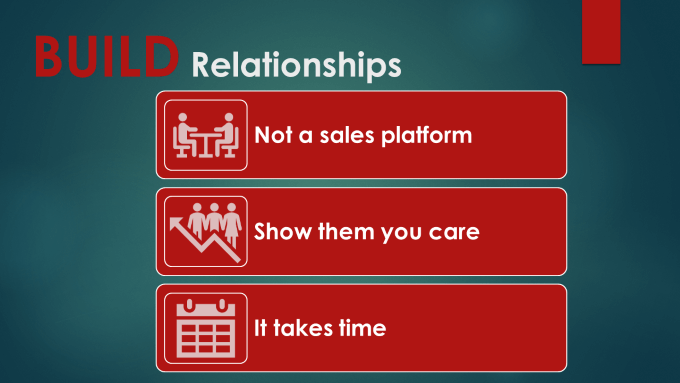
Present Data Using SmartArt
PowerPoint includes a diagramming tool called SmartArt. Use it to visually present information and data and creatively communicate your ideas. Convert bullet points into SmartArt for a more unique design option when you want to turn them into information and explainer videos.
Transitions & Animations
Animations affect how the elements on your slide move during a slideshow. They can enhance the appearance of your slides and help you control the delivery pace of your presentation.
Subtle and simple animations are most effective because they are not overwhelming. For example, for bullet points, use a wipe left-to-right or top-to-bottom instead of having them fly in and out.
Don’t bore your audience and make them wait for too many animations on one slide. Transitions refer to the type of animation between slides. Don’t use a different transition for every slide. Stick to two or three different transition effects.
Using too many of either will make your PowerPoint presentation chaotic, confusing, and annoying.
Practice Makes Perfect
After you have created your PowerPoint presentation, go through your slides and rehearse how you will present them in front of an audience. Also, practice your tone, delivery and timings.
Follow the suggestions above to make your presentation more engaging. Run through it as often as you need. You want to be confident and prepared when you deliver it to your audience.
Related Posts
David has a background in small business and lives in Australia. He is a WordPress and Ubuntu Developer who enjoys design, CSS and tech tool integration. Read David’s Full Bio
