The Quick Analysis Tool transforms the way you handle data analysis in Excel. This Microsoft Excel feature gives you easy and quick access to various analysis options. In just a few clicks, you can turn your data into concise and pivot tables, sparklines, or charts.
How to Find the Quick Analysis Tool
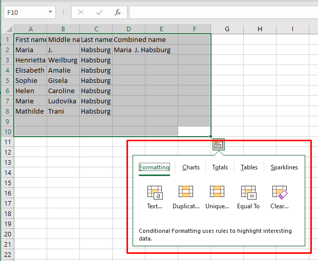
Most Excel features are easily found on the ribbon or in the menus. However, the Quick Analysis tool is different. It’s a discrete feature that’ll reveal itself when you make a selection of the range of cells. So go ahead, and highlight the range of cells you want to work with.
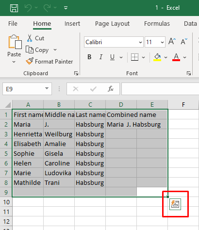
Notice a small box with a lightning bolt icon in it? It’s in the bottom-right corner of the selection you just made. That’s the Quick Analysis button. If you click it, a menu will open, and you can choose different features.
An alternative way to access the Quick Analysis feature is to press the Ctrl + Q keyboard shortcut. It’ll automatically activate the Quick Analysis tool.
Remember that the Quick Analysis tool won’t show up if you select empty cells, columns, or rows. It works only with data selection, so your highlighted cells should contain raw data.
How to Enable the Quick Analysis Tool in Excel
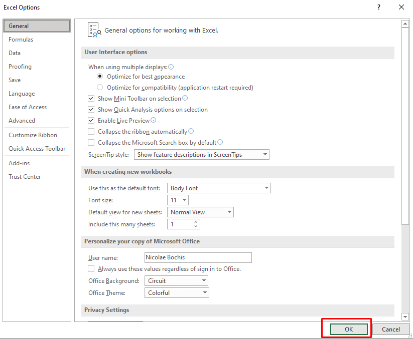
If you can’t see the Quick Analysis button even then, it could be that the feature is disabled in your version of Microsoft Excel. Don’t worry, you can enable it manually. Just follow these simple steps:
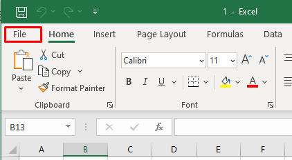
- Go to the File tab on the Excel ribbon.
- Select Options at the bottom of the left-side menu.
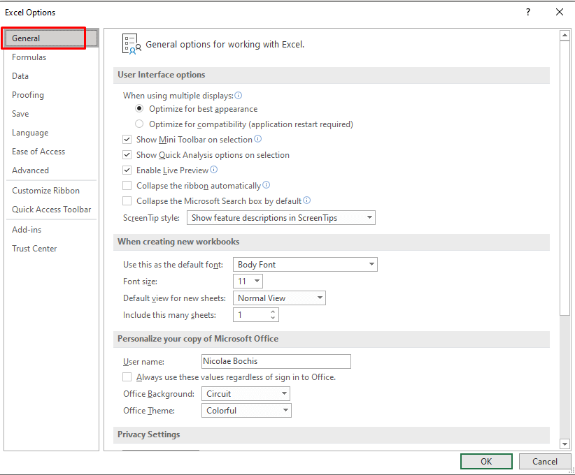
- Select General from the Excel Options window.
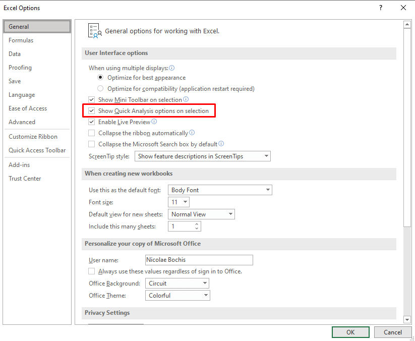
- Find the Show Quick Analysis Options on Selection and tick the box next to it.
- To save the preferences click the OK button at the bottom of the Options window.
Now, you’ll be able to see the Quick Analysis button when you make a selection. If you want to turn it off, uncheck the box next to the Show Quick Analysis Options on Selection.
Related: Need to see how accurately sample data fits a larger dataset? Check out our guide on calculating standard error in Excel.
Using the Quick Analysis Tool in Excel
The Quick Analysis tool is much easier to use than complex Excel formulas and functions. It’s very intuitive, and the menu is extremely user-friendly. To use the Quick Analysis tool, try the following:
- Select the range of cells on which you want to perform the data analysis. It can be any relevant dataset, from text strings to tables containing numbers.
- Click the Quick Analysis tool button that appears at the bottom of the selections, or press Ctrl + Q on your keyboard.
- Select the desired category of features from the Quick Analysis menu. You can hover over the specific option to preview how it’ll transform your data.
- Clicking the desired option will automatically apply it to the selected data.
That’s how easy and fast it is to use the Quick Analysis tool. But if you want to learn more about the available categories, continue reading.
Formatting
The formatting category allows you to format your selected data by applying conditional formatting options to it. The formatting options available to you will depend on the type of data you’re dealing with
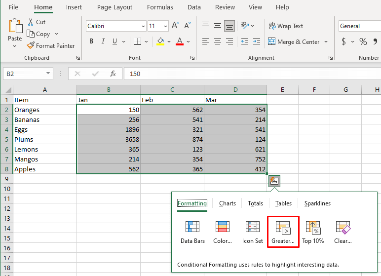
- Numeric data can use the Data Bars, Icon Sets, Greater Than, and Top 10% features.
- Text values can use Highlight Duplicates, Unique Values, Cells that Contain, or Exact Match features that’ll help you identify and filter data based on certain criteria.
- Dates data can be used to highlight the ones occurring Last Month, Last Week, Greater Than, Less than, or Equal To a particular date feature.
You can access the Formatting category with the keyboard shortcut Ctrl + Q and then by pressing F.
Let’s see this category as an example. Say you want to highlight cells with values above a certain number. Follow these steps:
- Select the range of cells you want to format and activate the Quick Analysis tool.
- Go to the Formatting group and select the Greater Than option.
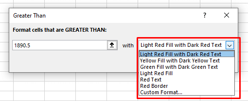
- A dialog box will appear. Type in the number you want to compare and select the formatting style. The default highlight color is light read, but you can change it to whatever you want.
- Click OK to confirm.
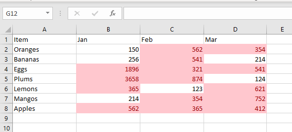
The result will look similar to this:
Related: Conditional formatting not quite doing the trick? Consider creating a heat map in Excel instead.
Charts
You can use the Quick Analysis tool to insert graphs and create charts in your Excel spreadsheet. Although the Quick Analysis tool has a limited range of options, it’ll suggest the most suitable chart based on the selected data.
Hover over each offered chart type to see how it’ll look like with your data. If you don’t see the type of charts you want to insert in the list of recommended charts, simply click on the More Charts option. The Insert Chart dialog box will open where you’ll have all the chart types displayed to select from.
Access the Charts tab by pressing Ctrl + Q and then C on your keyboard.
Here’s an example of how you can easily create a pie chart in Excel:
- Select the data range and access the Quick Analysis tool.
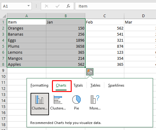
- Select the Charts tab from the Quick Analysis menu.
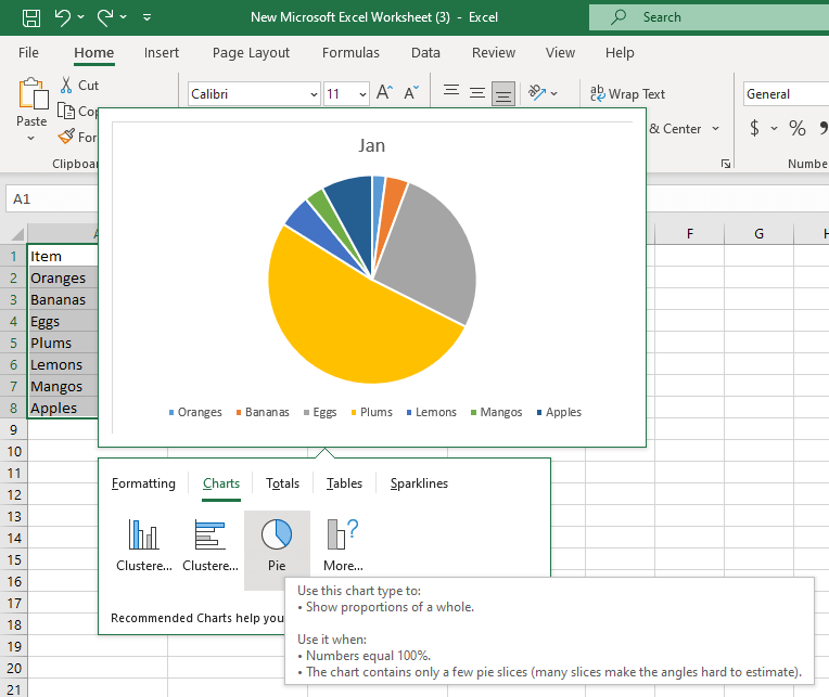
- Hover over the Pie Chart option. If you don’t see it, click More Charts.
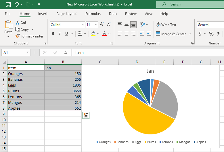
- If you like the Pie chart preview, click it to automatically insert it in your spreadsheet.
Totals
The Totals tab in the Quick Analysis menu allows you to quickly display summary statistics such as sum, average, count, percentage, and running total. The options for applying totals will depend on the type and format of the selected data you’re working with. If your data is text strings, the only option available to you will be Count. This option will show you the number of cells with text values.
You can calculate totals for both rows and columns. The vertical summary options have a blue colored line. The yellow vertical line designates the row summaries. To quickly access the totals tab, press Ctrl + Q and then O on your keyboard.
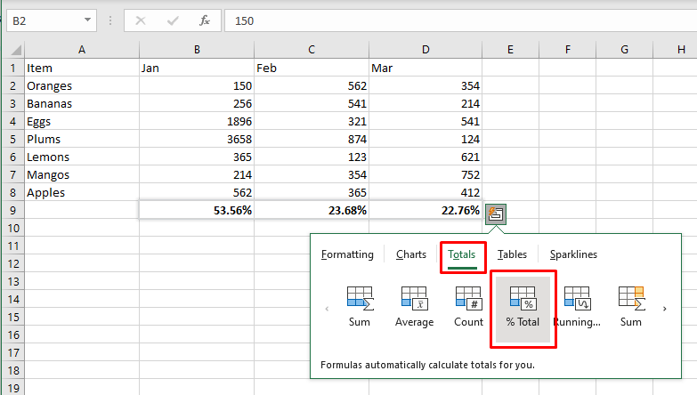
Let’s calculate the percentage totals for rows and columns on an example:
- Select the dataset and access the Quick Analysis tool.
- Select the Totals tab, and then the % Total option in the blue color.
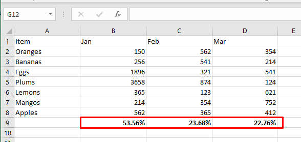
- This will calculate the percentage totals for each selected column.
Tables and Pivot Tables
The tables tab in the Quick Analysis menu will allow you to transform your selected dataset into a formatted Excel table quickly. Tables are very useful for data management because they have very handy filtering, sorting, and auto-expanding features. Aside from this, you can also insert a Pivot Table in a new spreadsheet using the selected cells as the source for a more comprehensive analysis.
You can quickly access the Tables tab by pressing Ctrl + Q and then T on your keyboard.
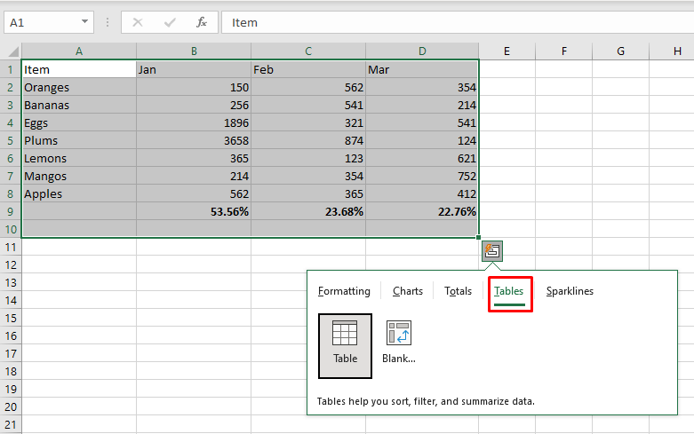
Let’s see an example of how to change a regular range into an Excel table:
- Select the data you want to convert into a table and access the Quick Analysis tool.
- Select the Tables tab, and select Table.
- The table will be inserted automatically, but you can later change its style using the Table Styles gallery in the Table Design tab in the Excel ribbon.
Sparklines
Do you want to display your data in an elegant and compact way? Use sparklines to make the patterns within your dataset visualized. You can choose from three types of Sparklines: Line, Colum, or Win/Loss. You can also think of them as mini charts.
The main goal of Sparklines is to make your Excel spreadsheet more readable, and visually pleasing, and to highlight important information. You can quickly access the Sparklines tab by pressing Ctrl + Q and then S on your keyboard.
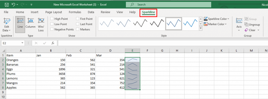
Let’s see an example of how to insert sparklines into your Excel sheet swiftly:
- Select the data range you’ll be working with, and access the Quick Analysis tool.
- Select the Sparklines tab and choose the preferred type: Line, Column, or Win/Loss.
- In the adjacent column you’ll notice sparklines were created, a visual representation of the selected data. Continue formatting and customizing your sparklines with the Sparkline tab in the ribbon.
As you can see in this tutorial, Excel’s Quick Analysis Tool helps you speed up tasks that once were manual. By familiarizing yourself with the tool’s capabilities, you can improve your workflow and present information in a digestible manner.
Related Posts
Nicolae is a Jack of all trades technology writer with a focus on hardware, programming languages, and AI image-processing software. Over the last five years, he has ghostwritten numerous tech how-to guides and books on a variety of topics ranging from Linux to C# programming and game development. Nicolae loves everything that has to do with technology and his goal is to share his knowledge and experience with others. Read Nicolae’s Full Bio
