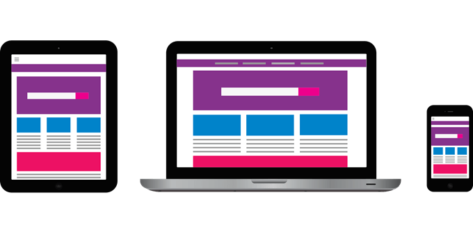
There is nothing worse than having a great-looking desktop website and a mobile site that doesn’t work correctly.
Most design fixes are simple but do require attention if you want visitors to stay on your site while browsing on a mobile device.
This article will highlight seven mobile friendly website issues and fixes for them.
- Changes Made Are Not Showing on Mobile
- Unfriendly Navigation
- Responsive Layout Stops Working Suddenly
- Images Are Taking Too Long to Load
- Most Important Content Isn’t Obvious
- Too Much Information
- Data for Small Screens
Mobile Friendly Website Updates Not Showing Up
You have just spent a lot of time making updates to your website. They look great on your desktop but don’t show up on your mobile device.
One of the most common reasons is caching. Your mobile browser could be showing an old version of your site which you previously downloaded. Another reason can be that your website is holding onto the old version of your page and not showing your changes.
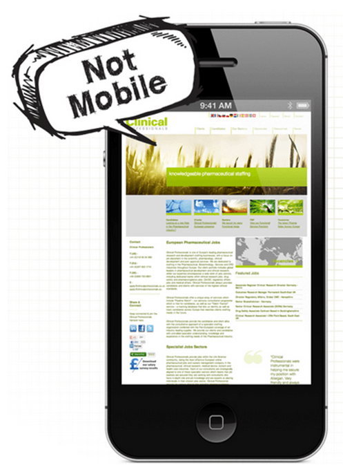
If this is the problem, you will need to clear the cache to download the revised version. A caching plugin such as WP Super Cache, W3 Total Cache, or WP Fastest Cache can help solve this problem.
Below are four steps to help you flush your website cache and browser to enable the new version to show on your mobile friendly site.
- Refresh your browser several times on your desktop and mobile device.
- Test your website on different mobile devices.
- Clear your site with a caching plugin.
- Check with your hosting company to see if there is another caching system on your server that needs to be cleared.
Unfriendly Navigation
It can be challenging to create a navigation menu that works well on mobile devices. If your website navigation has many items and submenus, it is even more tricky to squeeze everything on a smaller screen.
For example, if you only have three or four items in your website navigation, it should look fine on mobile. However, if you have more items and submenus, they will stack up on top of each other and look crowded.
Below are a few ways to fix this problem for a mobile friendly website:
- Turn your navigation into a dropdown menu for mobile devices.
- Display your navigation menu as block elements, so they appear vertically.
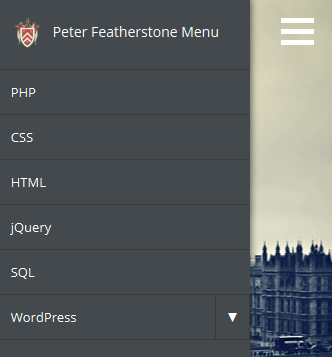
- Use a menu icon that can be toggled to take up less space.
- Create a mobile navigation menu using jQuery.
- Use the Hamburger menu (Many themes include this as an option or you can use a plugin.)
Responsive Layout Stops Working Suddenly
If your mobile friendly site suddenly stops working, it could be due to a plugin on your site.
Installing a new plugin or an update to an existing plugin could be causing a conflict with others that affects your responsive layout.
Start by deactivating each plugin one at a time to see if it is the cause. Don’t deactivate them all at once or you won’t know which plugin could be the culprit.

Code changes are another possible cause. If you have modified any code accidentally or intentionally, restore the original codebase and see if your responsive website starts working again.
When checking your site for mobile responsiveness, you should always test it on a mobile device.
Sometimes it appears to work when resizing the browser window on your desktop but doesn’t display correctly on mobile.
If one line of code is missing from an HTML header file, it can break the responsive design. This single line of missing code will cause your mobile device to assume the site you are viewing is a full-sized website.
The site rendered will be the size of the viewport (the size of the area of the web page that is visible to the user).
To fix your mobile friendly site, add the following line of code to the header section:
<meta name=”viewport” content=”width=device-width”>
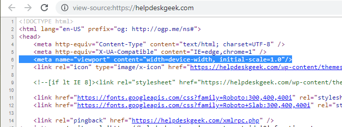
Sometimes when a theme is updated, this code can disappear.
Images Are Taking Too Long to Load
Optimizing images and reducing image file size makes sense. Large images that are not optimized can slow down the loading speed of your webpages. This can be frustrating to mobile users.
WordPress version 4.4 and above automatically serves up the smallest version of an image on your server.
If you are already running the latest version of WordPress, but your site is still not loading fast enough, you can:
- Install a plugin such as Smush Image Optimization, Compression, and Lazy Load to resize and optimize your images
- Use a compression and optimization tool before uploading images to your site such as TinyPNG, Compress JPEG, or Online Image Optimizer.
Most Important Content Isn’t Obvious
Some websites are loaded with a lot of unnecessary content to fill the empty space when opened on a desktop.
Websites developed without being conscious of mobile users generally fall under this category. These sites take more time and bandwidth to load.
If the pages aren’t designed appropriately for mobile devices, then part of the content may not appear on mobile without a lot of scrolling.
Most of the time, an element on your webpage will look one way on a computer and completely different on a mobile device.
For example, a pricing page with three columns will show them side by side on a computer.
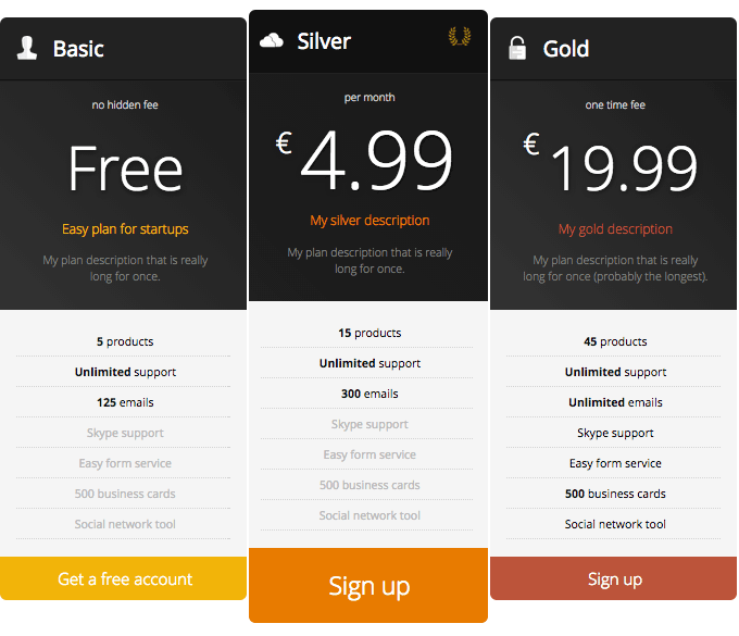
However, on a mobile device, the columns are stacked on top of each other because the screen size is smaller. This behavior is to be expected.
Make sure your pricing table is in a top position on your webpage so that it will appear first when viewed on mobile. If you have a lot of text over your table, mobile users will have to scroll down to see it and might not.
For the most optimal mobile user experience, put the most critical pieces of content towards the top of the page. If a user needs to scroll a lot before they can view your content, they probably won’t.
Too Much Information
Sites with complicated user-interface elements such as tables, multi-step forms, and advanced search features can produce a poor mobile user experience.
These elements contain too much information that can crowd a mobile screen and interfere with a user finding the information they want.
One approach is to remove or hide some content from mobile users. However, this is not an ideal solution for visitors who want to have access to these elements.
To avoid this problem, optimize your mobile friendly site as much as possible. Also, remove any unnecessary elements while focusing on the core structure of your website.
Data For Small Screens
Complex tables with many rows and columns can be a problem when viewed on small mobile screens. The best fix is to use responsive tables.
A plugin such as WP Responsive Table can make this easy to accomplish.
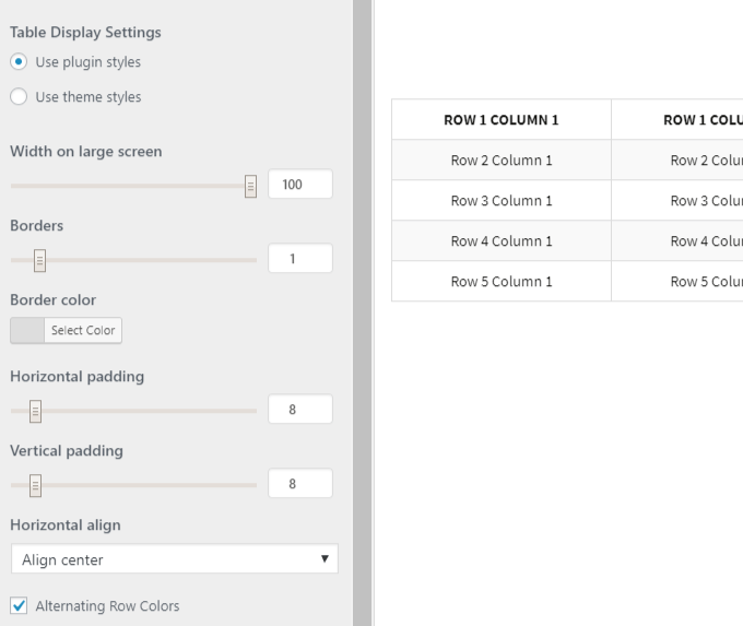
As with the pricing table above, when viewed on a mobile device, the columns will be stacked to fit the smaller screen.
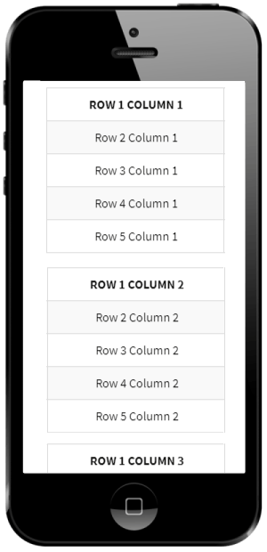
Other ways to show data on mobile devices include:
- Creating a smaller table without the grid layout to avoid the need for horizontal scrolling.
- Flipping a table on its side to fit better on a smaller screen.
- Replacing larger tables with smaller ones that link to the full version.
- Converting tables into pie charts.
As mobile usage is growing exponentially, it is imperative that business websites are optimized with mobile friendly versions. Enhance user experience without sacrificing functionality by following the steps above.
You should also always monitor your site’s performance and make tweaks when necessary to improve performance and user experience.
